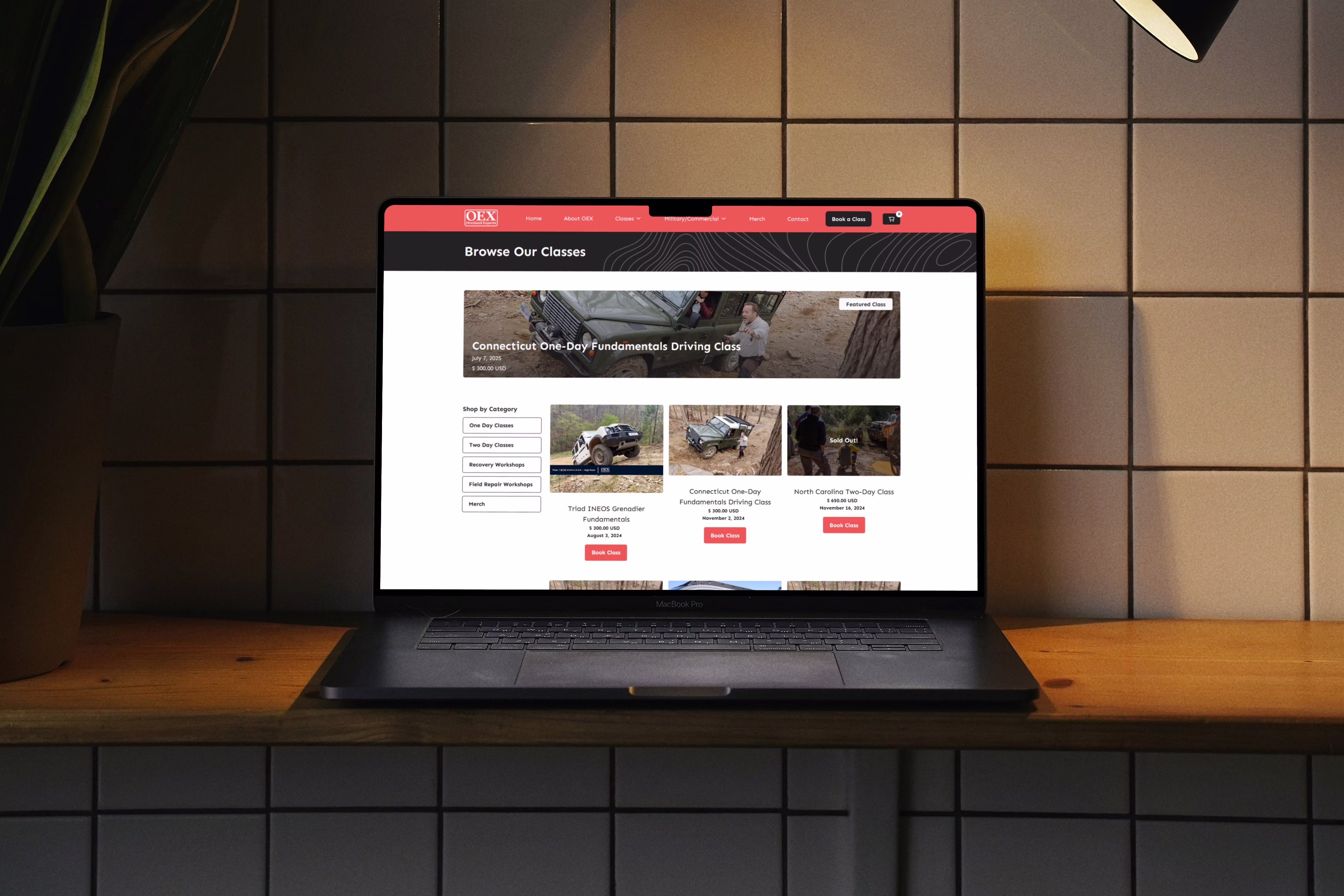
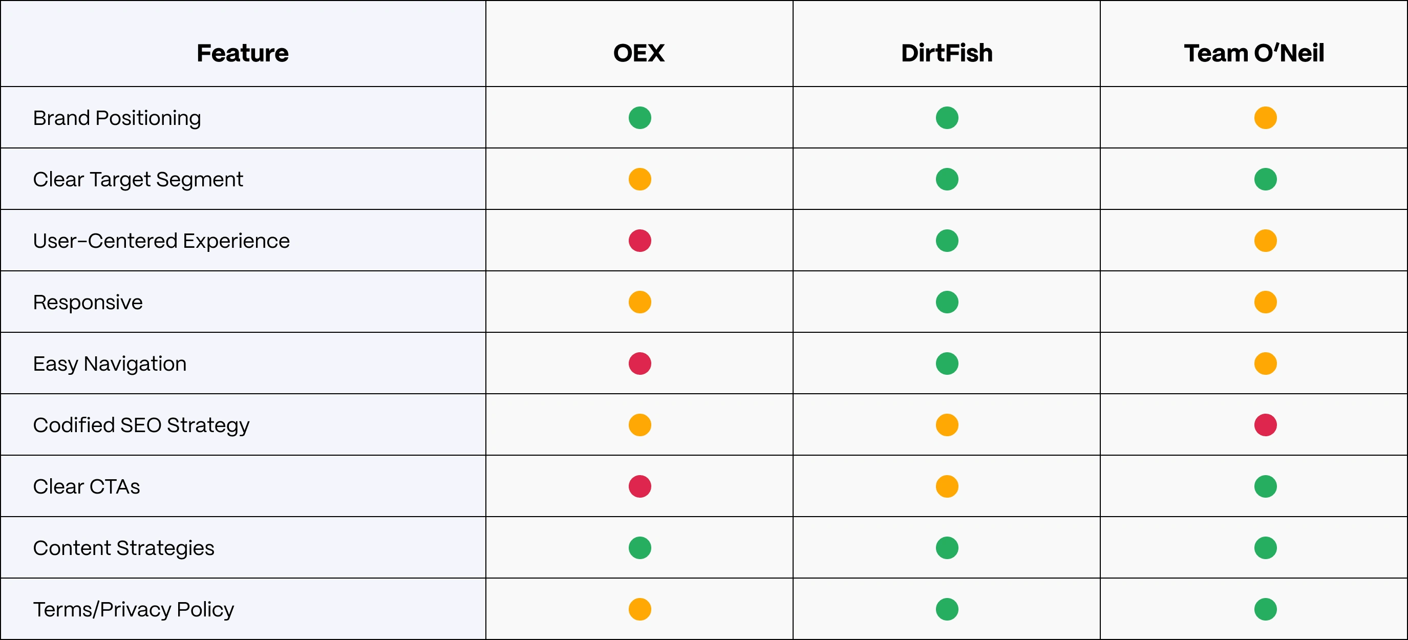
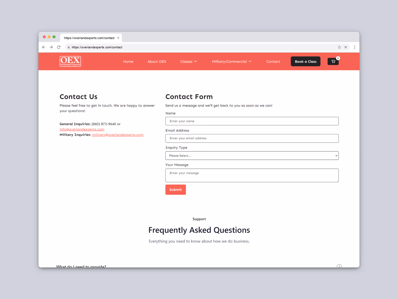
01. Confusing & Inefficient Navigation
The structure and redundancy of the navigation menu contributed heavily towards recreational users' confusion in moving throughout the site. Many of the menu options pointed towards similarly-designed pages with similarly-written content. This was an area where there was a lot of room for improvement.
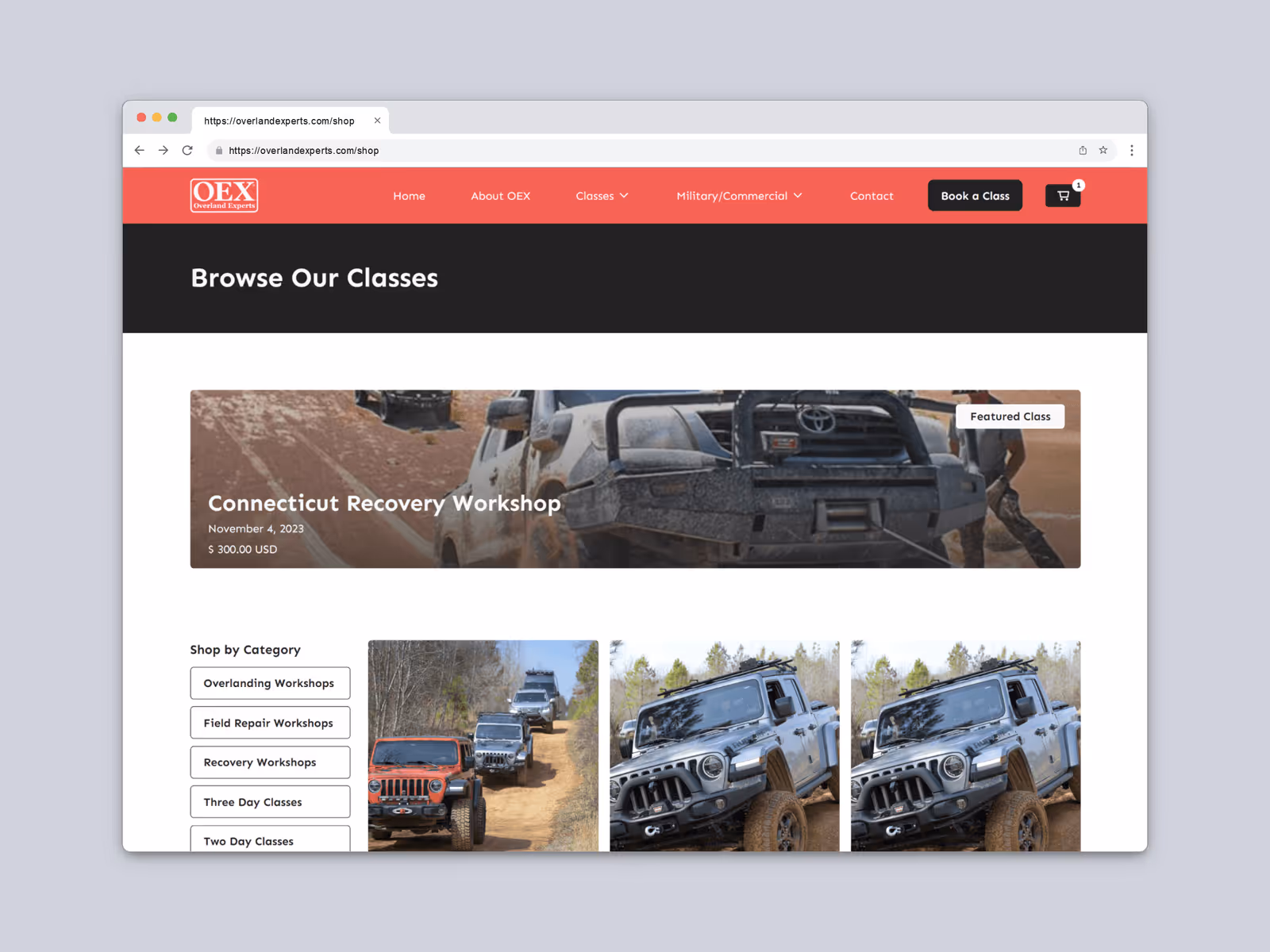
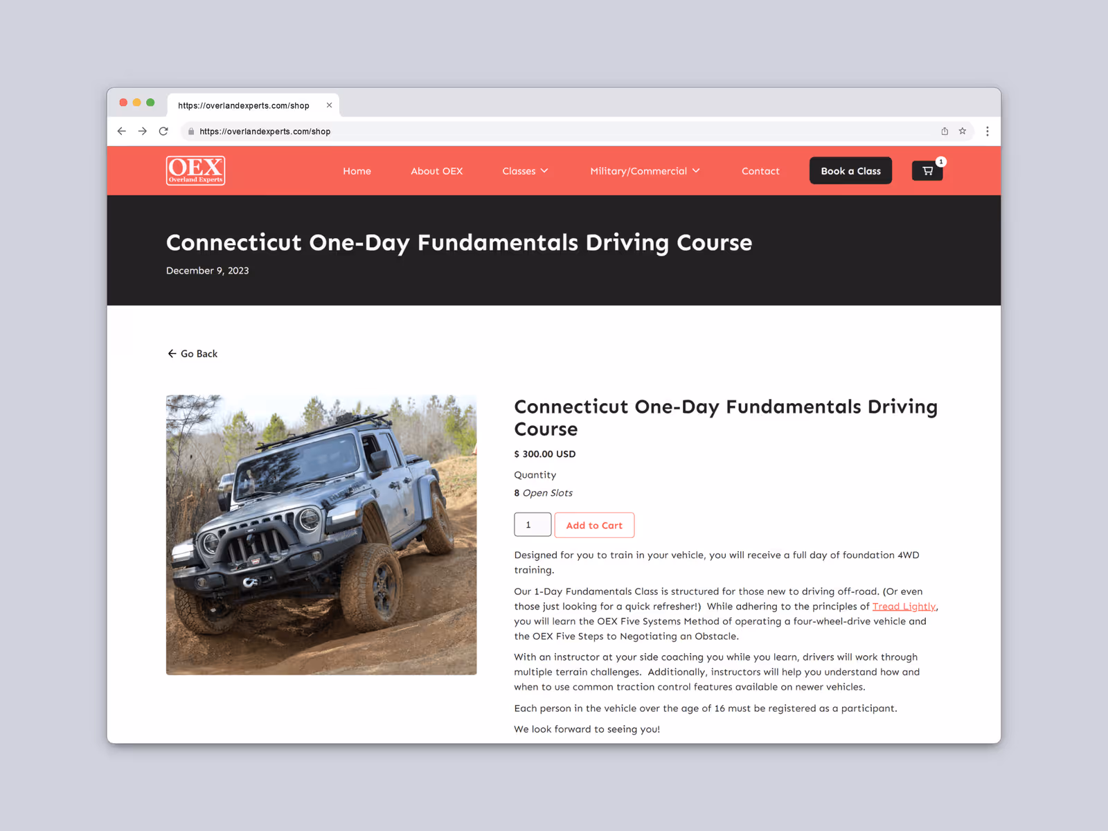
02. No Clear CTAs. Anywhere.
Because of the redundancy of information and content, it made it hard to know what the clear CTA is to book a class, contact the company, etc.
03. Bloated Sitemap & IA.
Similar to the nav menu, the site overall had many needlessly internally-looping links, and no discernible approach to the overall structure of the information architecture.